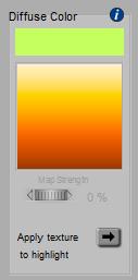
For short: Diffusion is equivalent to Object Color. This is the place to turn an object simply green, and/or to assign an image to it for a detailed coloring of the surface. The color swatch then works as a filter: when I assign an image as well as turn the swatch to green, it’s like I’m looking at the image through green glasses or through a sheet of green transparent plastic. A white swatch means: no filtering, and is generally recommended when images are used.
 makes
makes 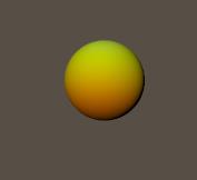
Clicking the larger area opens the Texture Manager, which offers the option to import an image.
More in detail
In nature, objects get their color by scattering back some of the light that falls upon them, and do so in a color-filtered way. So white light shining on a plants leaf will make it look green because the leaf scatters back the green portion out of the white light, at the place and time the light hits the leaf. When the light is pure red without any green in it, then the leaf cannot scatter anything back and hence will look black instead. This “scattering back” is called Diffusion, not to be confused with Reflection.
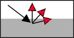 The amount of light which is received by a “unit of surface” (say 1 cm2 or in2) depends on the angle the light makes with the surface. Perpendicular lighting makes high intensities, skew angles make low intensities as the same amount of light has to shine on a larger area.
Also, the diffuse response to light usually will not be equal in all directions: the response perpendicular to the surface might be stronger than that parallel to it, making objects look darker at skew angles towards the camera. That is: at their edges.
Both effects are referred to as: shading, in contrast to shadowing which includes blocking the light by other objects, or other parts of the same object. In Poser all this is understood in the Diffuse part of the material definition.
Intermediate
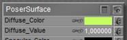 The Advanced interface into Poser Material Room offers a Diffuse_Color which makes it the equivalent of Simple interface, and offers a Diffuse_Value next to it which acts as an extra filter. Intensities are reduced by that factor, and it can be driven by a (greyscale) image map as well. This way one can easily make dark stains on a surface. See the various articles on how both Simple and Advanced interfaces relate, and on the way Colors and Values work together.
Recommendations:
- To prevent artefacts in rendering when applying the Gamma mechanism (recommended, available in PoserPro and Poser 10 and up) the Value setting should be kept to 1.0 only (or 0.0 but no intermediate values).
- To prevent overlighting when combined with other aspects of lighting and material definitions, it’s recommended not to exceed 80% brightness in the Color-swatch and maps (or in the Value setting when not applying Gamma).
As said, in nature the diffuse response to light usually will not be equal in all directions. This was already investigated upon by the mathematician J.H. Lambert (about 1750). In Poser, this “Lambert diffusion” is embedded in the Diffuse part of the material definition (Simple and Advanced interface), as well as implemented in the diffuse node (Advanced interface only). See the various articles on more background on Lambert, on details about the Diffuse node, and on assigning either an image or a movie respectively to the Diffuse slot(s).
Anyway, the diffuse light is scattered outward, that is: with following the surface normal, which is a vector perpendicular to the surface which generally should be pointing outward. For various reasons the latter is not always the case, depending on the way the object is made and imported into Poser. If not, it can make the scattering go in the wrong direction, causing black spots in the render. The solution is to force Poser to reconsider the surface normals, and I can make it doing so by ticking the Normals Forward checkbox. It’s in the node, as well as at the bottom end of the PoserSurface definition itself. It’s not available in the Simple interface.
That aside, the results from the “Lambert approximation” do not look utterly realistic for organic, porous surfaces. Therefore, Poser offers alternatives to the Diffuse component, like the Alternate_Diffuse part of the material definition, plus a Clay node with enhanced properties.
On top of all this: in nature, non-metallic objects get their color from diffusion, while metals get theirs from reflection. Especially when I’m into photorealism, it will be good to understand – and to implement – this difference. Metals don’t diffuse, they reflect.