Mainly for industrial purposes, the response of light by metals is measured in detail, and published in handbooks, Wikipedia, and the like. Graphs basically look like:
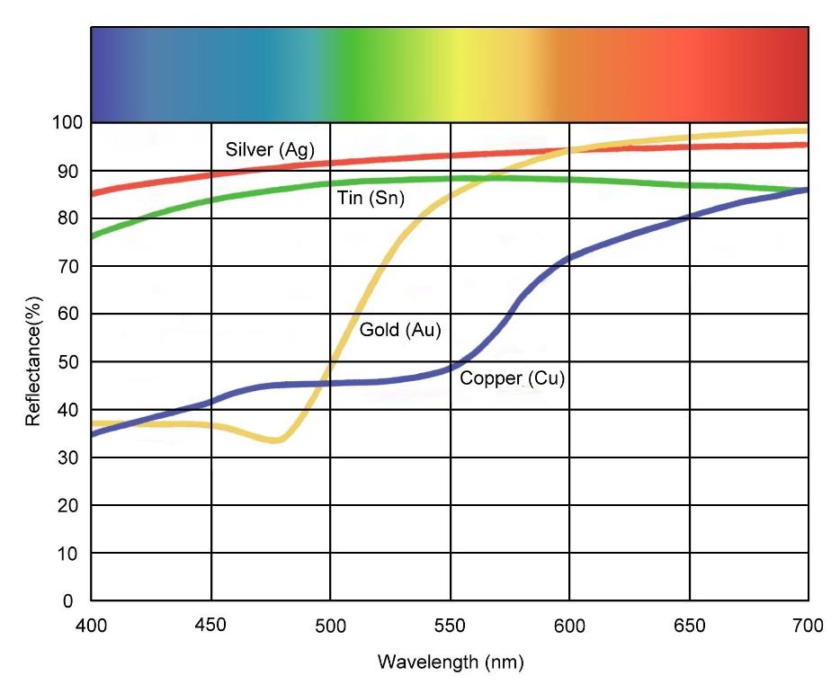
Take Copper for instance. About 37% reflectivity in the blues, 47% in green and up to 80 to 85% in the reds. That might read as RGB = (82% , 47%, 37%) or Hue 14° (out of 360) Saturation 55% Brightness 82%. Taking the previous article in mind, I can use that color and leave value at 100%. Or I can increase the color to 100% brightness (RGB = 255,147,115 or 100%, 57%, 45%) and use the 82% reflectivity for Value. The first approach is preferred, and looks like  .
.
Anyway, I also can see in the Graph that Gold compared to Copper is a far better reflector in the greens and yellows, and even worse in blue. That makes gold less red, more yellow, and a better overall reflector. Adding Silver for an alloy, a common practice, makes the gold even more reflective and more light-yellow. Silver itself is a very strong reflector in all colors and therefore will show White, while Tin will be slightly less reflective, and will have a very mild greenish taint over it.
The graph above is quite clear in its interpretation, but I might run into images like
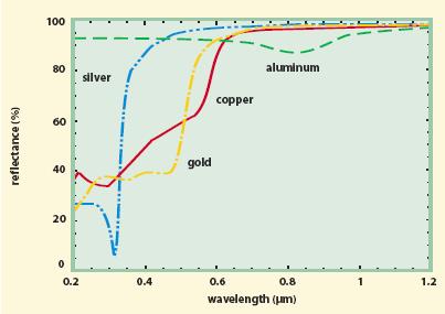
It’s the same story, but showing light response for a much wider color spectrum. Visible blue matches 400 nano-meter = 0.4 micro-meter while the graph starts at 0.2. And visible red matches 700nm = 0.7µm while the graph makes it till even 1.2, infra-red heat, well reflected by all metals as we know.
And the graph adds aluminum, which as I can see reflects slightly stronger in the blues than in the reds giving it a mild bluish taint.