Although I’ll grasp transparency from my own experience, and although most characteristics of it are available through the Simple interface into Material Room, its implementation in Poser is not the easiest to comprehend. That turns the presentation of this topic into a mixture of Simple, and Intermediate elements, plus some Advanced issues too. Sorry for that.
Formally stated, transparency is the ability of a surface to let light to pass through. Transparency is a number, 0-100%. When that number has different values at various spots on the subject, a (greyscale) image can be used. Note that – in Poser – the image is used in an inverted way: 100% or black means: fully transparent, while 0% or white means: fully opaque.
 or
or 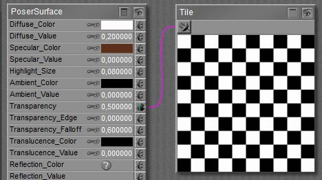 =>
=> 
See this article on how both Simple and Advanced interfaces relate.
The behavior of Transparency can also be stated in another way:
- When it’s just a value, then that value represents transparency (100% is fully transparent)
- When an image is attached to it (or any nodes are attached to it in Advanced interface), its meaning flips and the value is a multiplier for the resulting image_map which represents opaqueness instead: 1 (white) is fully opaque and 0 (black) is fully transparent.
More in detail
There are three different reasons surfaces can let light pass through:
- Because of lacking material. This is a lace-like transparency, usually supported by an image (the transparency map) representing the pattern of this materials presence or absence. This is the way to drill holes in a wall or in a jacket, and let the background (or an underlying shirt) shine through. White means presence of material and black means absence. For very fine – and hence almost invisible – patterns (e.g. nylon stockings), a uniform grayscale or just a transparency value can be used instead.
- Because a perfectly clear object is covered with a thin layer which filters all the light upon it. This is what’s meant by setting an intermediate value for transparency, or using an image (greyscale) map instead. Like the lace-like variant just mentioned, this thin-layer transparency is a pure surface effect. And in Poser, all object materials are surface properties.
- Because the material filters and colors the light passing through, as is the case in liquids and glass; it’s a glass-like transparency. In this case, using a transparency value is the common way to represent the amount of light which can pass through. Any colors from an image map will be ignored, and the (volumetric) effect has to be translated to a surface effect. For instance, a surface transparency set to 90% will represent an object transparency of 90% x 90% = 81% regardless of local thickness and shape, as the light passes through the front and back surfaces. Poser can’t handle thickness and shape but presents some tricks for escape, see Edges & Bends below. When I want to color (filter) the light passing through I’ve got to use the Refraction_Color or the Alternate_Diffuse component, which is available through the Advanced interface only (see the Refraction article for details). Then things get complicated.
Note:
When the material has a diffuse (surface coloring) component too, then this will show as far as the material is non-transparent. The diffuse material will not show in the holes in the surface, as driven by the transparency-map. Do note that the more transparent a surface becomes, the less it gets colored as the color is a property of the non-transparent portion of the surface. The specular component however is not affected at all by the transparency settings, so transparent areas on the surface can be as shiny as less (or non-)transparent ones. This is good for thin-layer and glass-like transparency. But for lace-like transparent surfaces, the holes should not be shiny at all, as there is no material in place to reflect the lights. Hence, for such material the transparency patterns should be copied to the specular settings.
 glass-like (highlights overall) <=>
  lace-like (highlights on substance only)
The same holds for Ambient, Bump, Displacement, and Reflection: when there is no material then there can’t be a surface response to light. But I have to tell Poser myself, as Poser does not distinguish the various interpretations of transparency (lace-like vs layer/glass-like). When using the Advanced interface: Transparency also does affect Alternate_Diffuse but does not affect Translucence, Refraction or Alternate_Specular.
Edges and Bends
When I look at, or through, a (semi) transparent object with various curves and bends, I will note that the frontal view differs from the sides. For hollow objects, light rays passing the front and back might meet less material underway compared with rays traveling through the sides. For solid objects this might be the opposite. On top of that, various causes for light-bends (called Refraction), absorption and scattering will reduce the transparency of objects at the edges. Next to all this, in real life transparency depends on the angle towards the camera: perpendicular angles have a much higher transparency than skew ones; for the latter, light rays just bounce off, and transparency decreases while reflectivity goes up. This advanced effect (known as Fresnel) is supported by recent versions of Poser, at the cost of serious prolongation of render times and increased memory requirements.
So when one wants an improvement over just transparency, without requiring the high level of photorealism that comes with Refraction, Poser offers a way to cheat to compensate for its inability to handle any kind of volumetric effects:
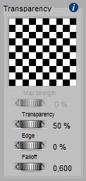
- Transparency_Edge defines the transparency at the edge, while
- Transparancy_Falloff defines the thickness of the edge.
As Transparency 1.0 means fully transparent, the Edge should have a (much) lower value to mimic the mentioned effects in a believable way. The default is 0.0, completely opaque at the edges. When I do it the other way around however, and set the edges to a high value like 1.0 (combined with a low value for transparency), the edge will fade away like I’m presenting a gaseous, cloudlike object.
Small values for Falloff make a fast transition from edge to regular surface, and hence make a thin “surface” layer for the object. This surface thickness seems proportional to the size of the object, the Falloff is a percentage of something, it’s not an absolute value. And although results can become quite unnatural, high values like 10 and up are possible and allowed.
Note:
Although Edge and Falloff make some sort of skin or surface layer for a transparent object, there is no sharp boundary at the inside. As a result, these parameters cannot make a hollow object.
 Raising Awareness
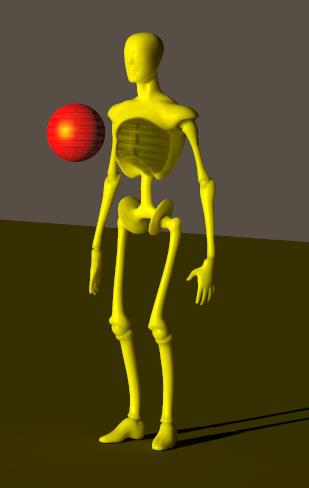
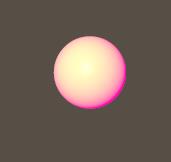
One image says it all: in Poser, yellow light passing through a red patterned-transparent ball will cast a patterned black shadow onto the object behind it, mixed with the yellow of the light. In nature, such a shadow would be red (as the passing light gets filtered).
Transparency won’t handle color at all, but it does make the pattern in the shadow. Diffuse will filter the light shining onto the ball and bouncing towards the camera. Refraction will sort filter the light passing through the ball from behind towards the camera. It’s objects only, and does not handle direct light at all but produces dark shadows instead.
Neither transparency, nor a diffuse or a refractive color will color-filter the light rays passing through the ball as such, and no reddening of the shadowed area will occur in any way.
Poser Firefly does have its limitations, and this is one of them.
Advanced
Transparency and the effect of Viewing and Lighting angles
Poser does not do anything with material properties or object thickness; it does not deal with object (volumetric) transparency but uses a surface transparency value instead. Poser behaves like a semi-transparent foil is wrapped around the object, and while the light passes through the object, the foil is passed twice. So, when the PoserSurface transparency is set to 70%, the object transparency equals about 50%, and the render will match nature’s behavior.
When the light passes under an angle, nature will reduce the transparency of the object because the path within the object (or through the foil, which does seem have some thickness anyway) becomes longer, and more light gets absorbed along the way.
The math: When – in real life – light passes a block or foil of semi-transparent material, with a thickness w (in meters or alike) and under an angle a, then a portion of that light will be taken out, and the remaining portion – known as object transparency – is exp{ -k*w/cos(a) } with k being a constant describing the material itself. Low k values, close to zero, make high transparency and large values make low transparency. The same way thick objects (large w value) are less transparent than thin ones. But as Poser does not support material properties or thicknesses, all I can do is set a surface transparency T in PoserSurface. Then the final object transparency will be T2/cos(a) .
Poser does support this angular behavior, but not exactly. I guess because that would require too many calculations during the render. But as the following graph shows, it does a nice job:
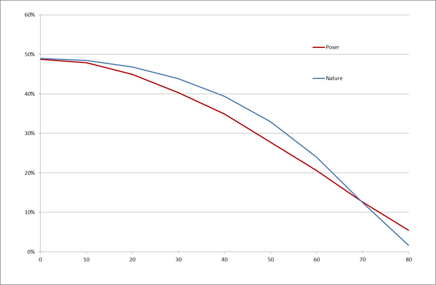
This is for a block with 70% surface transparency. Light which comes straight through will be dimmed to 70% x 70% = 49% object transparency. When it passes at a 30° angle Poser (red line) will dim it to 40% while in nature (blue line) it will be 44%, and at 60° Poser will dim to 20% while nature will reveal 23%.
Conclusion: For an application which is not doing any volumetrics, and is not raytracing except when assigned to do so for specific surfaces (reflection, refraction), Poser does quite a nice attempt to stay close to “the real thing” in an efficient and effective way. Transparency is a surface property, as if a foil surrounds the object at hand, but that foil is supposed to have some finite thickness and Poser supports the angular dependency which comes from that. At the detailed level, it does show differences which cannot be eliminated any further. Poser does have its limitations, and this is one of them.
Transparency and the effect of Gamma Correction
Consider an object A blocked by another object B, that is: B will cast some shadows onto A. For various reasons those shadows tend to look overly dark. For instance, because in real life light scatters around in the air thanks to tiny dust particles floating around, and because ceilings, walls and objects in the scene scatter light around as well. Poser offers a correction mechanism for that: Gamma Correction (aka GC), present in Poser 10 and Pro 2010, and up. GC will brighten up shadows and will dim highlights to give the render a more pleasant and more realistic look. So far so good.
Now, consider object B to be partially transparent, say 90% per surface. Light passing from its front to back will be reduced to 90% x 90% = 81% and object A will just receive less light instead of no light at all in the deep shadow. That will be catered properly by GC again. Actually, GC will brighten up the dimmed area back to about 90%, and keep it in sync with all other shadows and shades in the scene. But any light from A, through B towards the camera will be dimmed to 81% as well as being filtered by B’s transparency too. And as Poser cannot tell the difference from all those dimming effects, shadowing or transparency or anything, this transparency effect is brightened up to about 90% as well. As a result, the object B looks far more transparent than it’s designed to be, thanks to GC.
Now what should I do? Should I let Transparency bypass the Gamma mechanism resulting in proper shadows and a slightly too bright object, or should I let Transparency participate in the Gamma mechanism, with probably a more accurate object but too dark shadows, which can be brightened up in other ways? This is discussed in detail, but for short: I should do the first. Transparency should bypass Gamma like Bump and Displacement do. The object will be a bit off then, but when I act the other way, it will be off as least twice as much.
Next >
 makes
makes 
 or
or 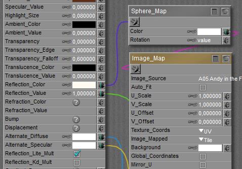
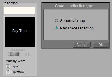 Note that in his case, those ‘real reflections’ will only consider the objects in the scene, and not the direct light sources around. To get the shine of lamps in the render, I either have to include some additional glowing objects in the scene, or I have to use specularity for this purpose. Also note, as said above, that the Reflection Lite Mult option (or: Multiply with Lights in the Simple interface) should be OFF for raytraced reflections as it serves the brightness adjustments of image based reflections (reflection maps). Raytracing makes the adjustments itself automatically, and having the option ON will then enforce the adjustments twice.
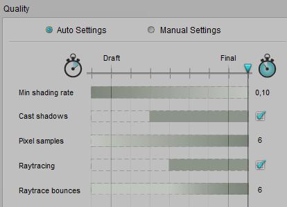 or
or 
 =>
=> 
 For short: specularity makes highlights on an object surface, representing the (blurred) reflections of the direct lights (infinite, spot, point) in the scene. Although color and an eventual image map both work as an extra filter, such a coloring filter should be applied to make believable metallic surfaces only (metallic car paint included). In the vast majority of cases, the color swatch should be a shade of grey. Small highlight sizes represent hard, smooth surfaces.
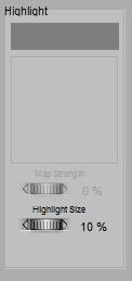
 Highlight_Size, available in Simple as well as in Advanced interface, is a straightforward parameter: small values make small, intense highlights representing hard, smooth, shiny surfaces while larger values make larger, blurred highlights instead. Like for Diffuse, Poser offers a
  <=>
<=> 
 makes
makes 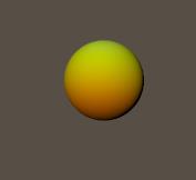
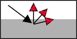 The amount of light which is received by a “unit of surface” (say 1 cm2 or in2) depends on the angle the light makes with the surface. Perpendicular lighting makes high intensities, skew angles make low intensities as the same amount of light has to shine on a larger area.
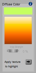
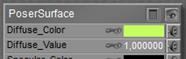 The Advanced interface into Poser Material Room offers a Diffuse_Color which makes it the equivalent of Simple interface, and offers a Diffuse_Value next to it which acts as an extra filter. Intensities are reduced by that factor, and it can be driven by a (greyscale) image map as well. This way one can easily make dark stains on a surface. See the various articles on how both